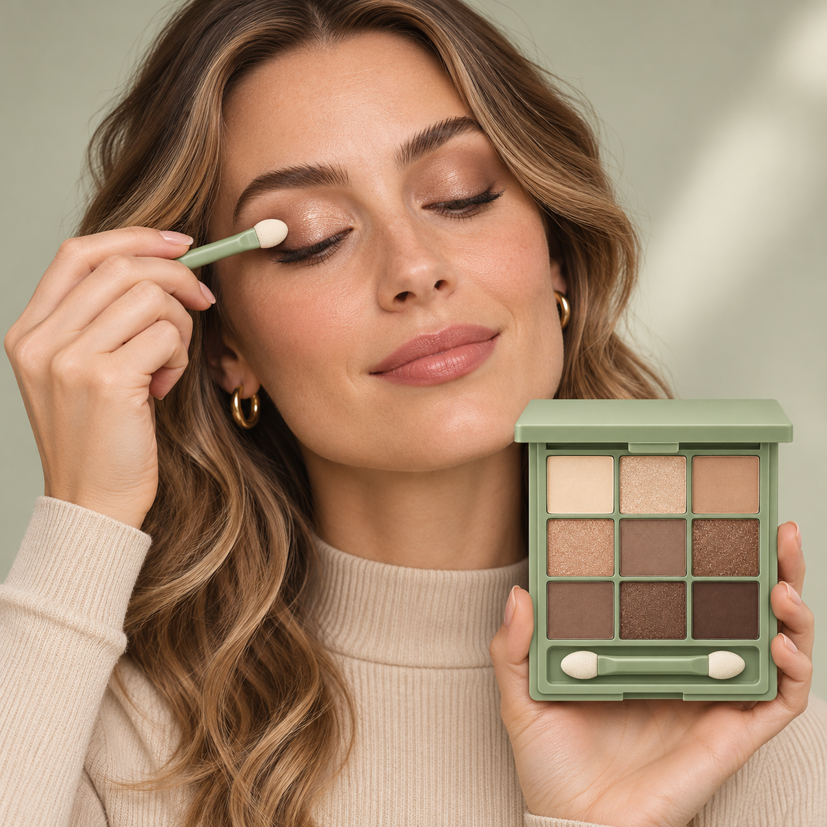
Mediade Nine-Shade Neutral Eyeshadow Palette — Champagne, Caramel & Cocoa-Inspired Colors in a Sage-Green Case with Dual-Ended Applicator
Mediade Nine-Shade Neutral Eyeshadow Palette — Champagne, Caramel & Cocoa-Inspired Colors in a Sage-Green Case with Dual-Ended Applicator
📢Try it now and if it doesn't work, we guarantee a full refund!
✅ Made in the UK
✅ 90-day money-back guarantee
✅ Natural ingredients for fast, long-lasting results
✅ Long-standing service to the London Early Years Foundation
⚡ Stock is limited and will sell out soon!
Couldn't load pickup availability
MEDIADE COLOR ATLAS / THE NEUTRAL COLLECTION
Nine Squares. A World of Quiet Color. Your Next Eye Look Starts Somewhere Between Champagne and Cocoa. 🌾
Open the sage-green case and follow the colors: pale cream, warm sand, soft brown, reflective champagne, and deeper cocoa-inspired tones. The Mediade Nine-Shade Neutral Eyeshadow Palette brings these visual notes together in a three-by-three arrangement, giving your next makeup look a clear place to begin.
This is not a palette that asks you to become someone else. It invites you to explore the colors you already love with a little more intention. Choose a lighter shade for a restrained look, introduce a deeper brown for definition, or make a reflective tone the focal point. Nine pans create room for decisions without turning your dressing table into a complicated project.
Your neutral color atlas · $47.30 USD

🗺️ Read the Palette Like a Color Map
You do not need to use every shade to appreciate the arrangement. Think of the lighter colors as possible starting points, the mid-tones as ways to introduce shape, and the deeper colors as accents that help you decide where the eye should focus.
The following names describe the appearance of the photographed colors. They are visual guides, not printed shade names or a guarantee of how each shade will appear on every complexion.
The Upper Row / Cream, Champagne, Sand
Upper left: A pale cream-beige color with a comparatively low-reflection appearance in the close-up.
Upper center: A light champagne-inspired shade with a visibly sparkling surface.
Upper right: A warm sandy tan that sits between the pale and deeper shades in the palette.
The Middle Row / Copper, Taupe, Bronze
Middle left: A warm copper-gold-looking shade with visible reflection.
Center: A medium taupe-brown color with a quieter-looking surface.
Middle right: A richer bronze-brown shade with a sparkling appearance.
The Lower Row / Earth, Deep Bronze, Cocoa
Lower left: An earthy medium brown for exploring a deeper neutral direction.
Lower center: A dark bronze-brown-looking shade with visible reflective detail.
Lower right: The deepest cocoa-inspired brown in the photographed arrangement.
🧵 Choose a Look, Then Choose Your Colors
A useful eye look begins with an idea, not a requirement to use a long list of shades. Decide what you want to emphasize first: softness, warm reflection, or a little more depth. Then select a small group from the palette that supports that direction.
The Linen Edit / Light and Understated
Start with the light cream-beige and sandy tan as your color references. Keep the overall shape soft, and use only a small amount of a medium brown if you want more definition. Pair the look with a softly groomed brow and a muted lip so the entire face stays quiet and coordinated.
Think of this as your white-shirt or oatmeal-knit direction: less contrast, fewer competing details, and enough room for your natural features to remain the focus.
The Copper Hour / Warmth with a Reflective Center
Build the idea around the warm tan and copper-inspired shade, using a medium brown to frame the eye if desired. Keep the reflective color as a deliberate accent on the lid rather than adding every sparkling shade at once.
A peach-inspired cheek and a rose-nude lip can echo the warmth. This is the styling mood shown in the model reference: coordinated neutrals with a reflective lid detail, not an instruction to reproduce the photograph exactly.
The Cocoa Outline / A Deeper Neutral Statement
Use the medium browns as your starting point, then introduce the deepest cocoa-inspired tone selectively toward the outer lid. Keep the darker color controlled and check the shape with your eyes open before deciding whether to add more.
For contrast, consider one lighter reflective shade on the lid, leaving the deeper brown to define the surrounding shape. Let the eyes lead and keep the rest of your makeup edited.

🪵 A Case That Belongs to the Color Story
The packaging does more than frame the pans. Its muted green color provides a calm contrast to the warm shades inside, giving the open palette an earthy, coordinated appearance. Straight dividers make each square easy to identify, while the matching green applicator continues the same visual theme.
Beneath the nine pans is a dedicated recessed channel holding the dual-ended tool. Pale rounded tips sit at either end of the handle, clearly visible in the product close-up. The hinged lid completes the compact's simple rectangular silhouette.
The photographs show the arrangement and exterior appearance. They do not establish exact dimensions, material composition, or durability, so check the product packaging for those specifications where provided.
☕ A Little Story About Your Everyday Browns
You know the kind of morning: coffee cooling beside the mirror, a favorite cardigan waiting on the chair, and just enough time to make one thoughtful choice. You are not looking for a completely new face. You want your usual makeup to feel a little more finished.
You open the green palette and choose two shades instead of five. A warm tan sets the direction. A champagne-inspired detail adds a little reflection. You pause, look at the result with your eyes open, and decide that is enough.
Another day, the same palette might inspire a deeper brown outline or a copper-toned lid. The appeal is in having related colors close together so your next choice can begin with a familiar visual reference. Your routine can stay recognizable while your emphasis changes.
📐 Small Application Decisions That Make the Look Yours
- Begin with the label directions and clean tools. Prepare the eyelid using your usual eye-makeup routine, keeping product away from the eye itself.
- Pick a light, middle, and deep reference. You may use only one or two, but comparing the shades first helps you understand the amount of contrast you want.
- Start with a small amount. Assess the color on your skin before adding more. The shade in the pan is not an exact preview of every application.
- Keep the edges intentional. Use an appropriate clean blending tool if you prefer a softer transition. Let your eye shape guide placement rather than following a rigid diagram.
- Check with eyes open. Look straight ahead and then slightly to each side. Compare both eyes before making the look deeper or more reflective.
- Finish by assessing the whole face. Balance the eye colors with your cheek and lip choices, rather than judging the eyes in isolation.
Follow the intended-use guidance on the product packaging. Do not apply inside the eye or to the waterline unless the label specifically permits it. Keep applicators clean, avoid sharing eye-makeup tools, and discontinue use if irritation occurs.

🔖 The Useful Details, Without the Guesswork
How many colors are shown?
Nine separate square pans are arranged in three rows and three columns.
Does the green case mean the shadows are green?
No. The case and applicator handle are green; the photographed shadows are predominantly cream, champagne, tan, and brown tones.
Are all the shades equally reflective?
The images show a mixture of quieter-looking surfaces and visibly sparkling shades. Refer to the photographs for their relative appearance, since lighting influences how each finish reads.
What tool is pictured?
A matching green dual-ended applicator with pale rounded tips rests in the compartment beneath the pans.
Will the swatches and model look match my results?
They are visual references. Your skin tone, preparation, tools, application amount, and lighting affect color appearance.
Is there a wear-time or ingredient claim?
This description does not promise a specific wear duration, water resistance, ingredient profile, or sensitive-eye suitability. Consult the packaging for ingredients and usage information.
CREAM / CHAMPAGNE / CARAMEL / COCOA
Your Next Look Does Not Need More Noise. Just a New Point of View. 🍂
Nine neutral colors, a sage-green frame, and a coordinated applicator. The Mediade palette gives you a visually connected collection to explore, whether you favor quiet cream-and-tan combinations or richer bronze-and-cocoa styling.
Start with the shade that catches your eye. Choose the contrast that suits your mood. Let the rest of the look follow.
Mediade Nine-Shade Neutral Eyeshadow Palette · $47.30 USD
A familiar color family. A fresh way to make it yours.

Mediade Nine-Shade Neutral Eyeshadow Palette — Champagne, Caramel & Cocoa-Inspired Colors in a Sage-Green Case with Dual-Ended Applicator